Moving beyond Strike Rates and Profit/Loss
Successful betting on racing – or indeed anything – relies on being able to accurately quantify, at least to some degree, the likelihood of something happening. There are myriad ways of doing this and, increasingly, punters are using data and statistics to isolate that most elusive of concepts, value.
At the most basic level are entities such as win percentage and profit & loss figures. For example, trainer x has won at track y with 21% of her runners, for a profit of +5.52 in the last two years.
On the face of it, those are good numbers – and they may stand further scrutiny – but when is a good stat not a good stat? Answer: when it’s not sustainable. Eh?
What I mean is that, as bettors, we need to find snippets of information that relate to something which not only performed well in the past but also offers potential to do so in the future: after all, we can’t bet the winners already in the form book, can we?
This is where the quest for meaning beyond win strike rates and P&L begins. It’s not a difficult journey, and it is very much worth taking, because it will improve your understanding of data – which these days underpins pretty much everything in racing form, and in life – no end.
Importantly, the less mainstream numbers can be a fun part of the puzzle and easy to interpret. In short, if you’re not already doing so, you ought to start calling on them.
For example, consider Mark Johnston’s record at Chelmsford. In the past year, at time of writing, he had a 12% win rate for +20.51 profit on 91 bets. That’s a return on investment of 22.5%. Pretty good, right?
Wrong!
The image below relates that all of the profit and more was attributable to one 50/1 winner, Ventura Vision on 12th November.

The problem with P&L is that it doesn’t tell the underlying story; it doesn’t help us understand whether the historical profit is likely to be repeated in future. So how do we know if history can be relied upon going forwards?
One way is a metric called Actual vs Expected (also known as Actual over Expected, or A/E). This metric aims to establish how many more, or less, winners have been achieved compared with what might be expected based on the odds of runners.
The management summary is that 1.00 is a par score – no better or worse than expected – and that above 1.00 is good, below 1.00 is not good, and the further away from 1.00 the better or worse things are.
In slightly more detail, we are looking to establish the ‘expected’ number of winners, in order to compare with the actual number of winners.
Here’s how:
To establish a runner’s SP in percentage terms, we do the sum 1/ ([SP as a decimal] + 1).
So, 4/1 SP would be 1/ (4 + 1), or 1/5, which is 0.20,
Evens would be 1/ (1 + 1), or 1/2, which is 0.5,
1/4 would be 1/ (0.25 + 1), or 1/1.25, which is 0.8, and so on.
This table has the maths for Nicky Henderson’s bumper runners at Newbury in the last two years.

We can see from ‘Pos’ – position – column that Nicky had two winners; and we can see from the ‘Exp’ – expected winners – column that his expected figure was 1.47.
Calculating A/E is simply a question of dividing one by the other, so 2 / 1.47 = 1.36
Again, the mechanics are irrelevant and merely published for context. The key is that north of 1.00 is good and, therefore, Henderson’s 1.36 here is very good (albeit on a tiny sample size carefully chosen for space-saving example purposes!)
We can see that, based on the odds of the runners, the market expected Hendo to achieve less winners than he actually did; and that’s a bellwether of potential future profitability.
A problem with A/E is that it can sometimes suggest it will be lucrative to follow very low strike rate trainers; the problem being that you need to be geared up mentally and in terms of your betting ‘tank’ to ride out extremely fallow – no winners – periods.
Most people are not equipped for that. I most certainly am not!
This is where Impact Value comes in. Impact Value, or IV, is a measure of how often something happens within a subset of the data versus the superset (or total) data.
It works on the basis of the same ‘1.00 is par’ scale as A/E, with figures above 1.00 being better than par (i.e., happening more frequently) and below 1.00 being poorer (i.e., occurring less often).
In plain English, and as an example, let’s consider how often Nicky Henderson wins in Newbury bumpers compared with all trainers running horses in Newbury bumpers.
In the last two years, 152 horses contested 13 bumpers at Newbury. Of those, Henderson saddled nine runners for two winners. IV is calculated as follows:
(‘Thing’ winners / All winners) / (‘Thing’ runners / All runners)
So…
(Hendo Newbury bumper winners / All Newbury bumper winners) /
(Hendo Newbury bumper runners / All Newbury bumper runners)
which equates to
(2 / 13) / (9 / 152) = 0.1538 / 0.0592 = 2.6
Nicky Henderson’s Newbury bumper runners, therefore, have an Impact Value of 2.6, which is to say they are a little better than two-and-a-half times more likely to win than average.
Why is this useful? Because, unlike a win strike rate, which is a fixed number (e.g., 20%), IV flexes to account for whatever is average within a peer group. Thus, an IV of 1.00 will always be standard for whatever is being measured, regardless of what the associated win strike rate is.
In real terms, and by example, the average strike rate of horses making their handicap debut in the last two years is just shy of 10%. The average strike rate of horses who won their previous race is a little better than 19% in the same time frame.
So, a trainer whose handicap debutants win at 15% is doing really well, while a trainer whose last time out winners double up at 15% is under-performing. Impact Value makes this simple to understand: the handicap debut 15% trainer has an IV of around 1.5, the last day winner 15% trainer has an IV of around 0.78.
We know that 1.00 is par, so it’s very clear which is doing well, and which is not.
The third and final metric to bear in mind is a little more esoteric than the first two, and it is Percentage of Rivals Beaten (PRB). PRB attempts to solve the challenge of small sample sizes which is almost constant in horse racing form: by the time there’s a large sample of evidence, any edge has been fully subsumed within the market and, therefore, evaporated.
PRB gives a score between 1 (the race winner, 100% of rivals beaten) and 0 (0% of rivals beaten, tail end Charlie) to every horse in every race.
By averaging these scores, we can work out, for instance, the draw bias at a given course and distance, or a trainer’s underlying performance.
The calculation is (runners – position) / (runners – 1)
So, in an 11-horse race, the third placed horse has beaten 80% of rivals:
(11 – 3) / (11 – 1) = 8 / 10 = 0.8 or 80%
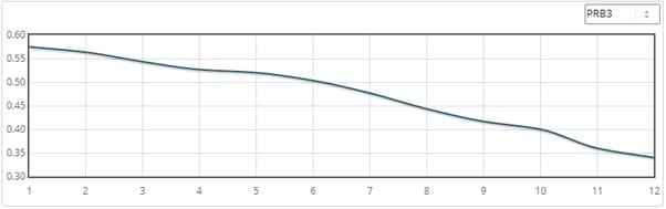
Here’s how this looks in the draw chart for five-furlong 8+ runner Kempton handicaps:
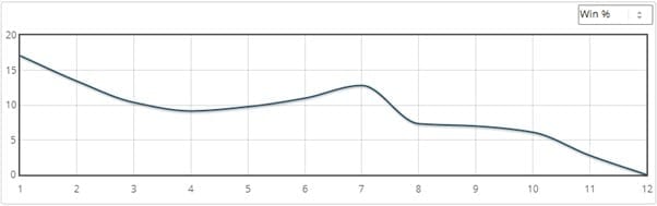
Compare that with the win chart for the same data:
The first chart is actually PRB3, which is the average percentage of rivals beaten of a stall and its immediate neighbours (e.g., for stall 2, PRB3 is the average PRB of stalls 1, 2 and 3).
As can be seen it smooths the curve and filters out any noise there might be in a dataset. As such, it’s very useful for quickly reviewing the ‘real’ impact of something, in this example, stall position.
With PRB, and PRB3, 50% of rivals beaten – or 0.5 – is par. Thus, a number above, say, 0.55 is a good performance and a number below, say, 0.45 is a weak one.
Summary
I’ve talked about the mechanics of three metrics in the above. While it might seem a little dry as a subject, these numbers can turbo charge your understanding of value. And the best news is that for two of them, Actual vs Expected and Impact Value, it’s only a case of knowing whether the figure is north or south of 1.00!
Actual vs Expected (A/E) is a measure of sustainable profitability.
Impact Value (IV) is a measure of peer group performance.
Good A/E figures imply an angle is under-bet; good IV figures relate that something happens more often than might be expected.
When they appear together, we have something that happens relatively frequently and is at least somewhat under-valued by the market. Bingo!
Readers can calculate these figures for themselves based on the formulae in this article. Or feel free to use Geegeez Gold, which includes them as standard in reporting output, along with some handy filters to whittle down to the very best options each day.
Good luck!
Matt Bisogno
Too complicated? Try our backing favourites system
We had a chat with Michael Carr
Featured Image: Image by Gerd Altmann from Pixabay